On todays’ era of the Internet, content users consume on many devices ranging from desktops to tablets to smartphones. You lose traffic, conversions, even search engine ranks if your web site or application does not display perfectly well at various screen widths. Responsive designing is the technique that allows creating an ideal experience for users of any device type. Sydney web design solutions are crucial in providing responsive solutions that enhance accessibility and performance across all platforms.
Table of Contents
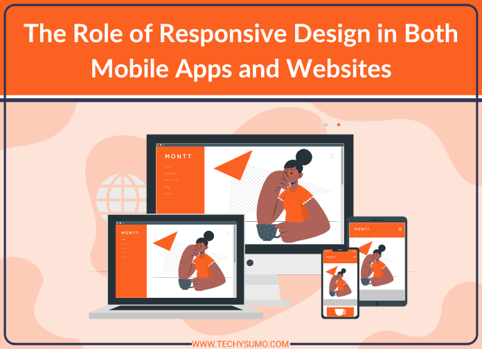
What is Responsive Design?
Responsive design is a way of web and mobile site and app designing that involves creating content which transitionally changes between a range of screen orientations and sizes. Rather than producing many versions on various devices, responsive design uses flexible grids, pictures, and CSS media queries to produce a fluid experience. It gives the users easy-to-use navigation, rapid page load times, and improved usability on many devices.
The Importance of Responsive Design in Mobile Apps and Sites
1. Improved User Experience
Responsive and nicely trimmed layout enables visitors to browse through content with minimal rescaling, panning, or zooming. This enhances usability and interaction, reducing website bounce rates and increasing mobile app retention.
2. Improved Search Engine Ranking
Google prefers mobile-friendly websites for search rankings. With mobile-first indexing, non-responsive sites get penalized and thus see their visibility in search engines reduce. The responsive design maintains your site at the top of rankings and drives more organic traffic.
Also Read


3. Cost-Effectiveness & Maintenance Simplicity
Instead of creating multiple versions of an app or website for many different devices, responsive design streamlines the process. This is cost- and maintenance-saving and gives a cohesive experience on devices.
4. Faster Loading Times
Mobile users demand quick page loads, and a responsive layout guarantees best-in-class performance. Responsive applications and websites are faster to load because they strip out extraneous content and compress images, making them more user-friendly and less likely to be abandoned.
5. Higher Conversion Rates
A responsive design breaks down barriers to interaction so that users can find their way, learn, and complete tasks such as buying a product or filling in a form more easily. Better UX equates to better conversion rates and greater business success.
Most Important Aspects of a Successful Responsive Design

1. Fluid Grid Layouts
A fluid grid layout enables website and app elements to scale proportionally instead of using fixed measurements. This ensures seamless adaptation to different screen sizes.
2. Flexible Images & Media
Using flexible images that automatically resize and adjust based on the device ensures visual content remains sharp and uncluttered. This prevents distortion and enhances aesthetics.
3. Mobile-Friendly Navigation
Simplified menus, touch-friendly interaction, and easy-to-click objects make for an effortless and frustration-free navigation process on smaller devices.
4. Optimised Typography & Readability
Text has to be legible on any device. The application of the correct font sizes, spacing, and contrast makes reading easier and boosts content engagement.
5. Fast Loading Speed Optimisation
Minimization of big files, lazy loading of images, and caching techniques optimization reduce the load times to ensure a smooth user experience.
If you’re searching for a mobile app development agency in Sydney, or professional Web design little rock services, opting for a team with specialization in responsive design will ensure your app or website runs flawlessly on all devices.
How Responsive Design Benefits Business
Improved Brand Credibility
An effortless and professional website or app enhances credibility and trust. Customers are more likely to interact with a brand that has a seamless digital experience on any device.
Broader Audience Reach
Through a responsive design, companies can reach more people, including mobile and tablet users, without investing extra development resources.
Future-Proofing Digital Presence
As new technologies roll out, an adaptable design lets your site or app adjust as needed without forcing extensive overhauls.
Responsive design plays a crucial role in enhancing user experience across both mobile apps and websites. If you’re looking to improve your website’s performance, check out our blog, “Increase Conversions On Your Website.“ It provides valuable insights on optimizing design elements and functionality to turn visitors into customers effectively.
Conclusion: Future-Proof Your Digital Strategy with Responsive Design
Regardless of whether you’re building a mobile app or website, responsive design isn’t a choice—tops on the list. With more people accessing content on different devices, providing an integrated and satisfying experience is key to success. Responsive design improves user experience, besides which it improves SEO ranking, conversion rates, and brand trust.
With a responsive strategy, companies can keep up and provide a smooth digital experience on all locations and devices where customers interact with their brand. Make the smart choice now—opt for responsive design and unlock unlimited potential!