Perhaps you’re wondering to create user-friendly web forms have in common with user experience on your website, blog, or social networks.
Honestly, everything. The answer lies in the data.
Let’s use checkout to create user-friendly web forms as an illustration since they tend to be the most significant forms on the web today. In the Baymard Institute research that comprises the data of 37 different e-commerce studies — on average, 69.23% of online shoppers abandon shopping carts.
Table of Contents
Why Create User-Friendly Web Forms?
As you can see from the chart above, a good deal of online shoppers (28%) give up because of a cumbersome checkout experience. The central part of the checkout experience is a checkout form.
Now you get the idea about the importance of forms in user experience and the correlation with your conversion rates.
Also Read
Let’s define the main checkpoints where you might be using forms and ways to improve them to make your users fly through the process.
Also read: 8 Critical SEO Trends You Must Know to boost your website.
1. Contact

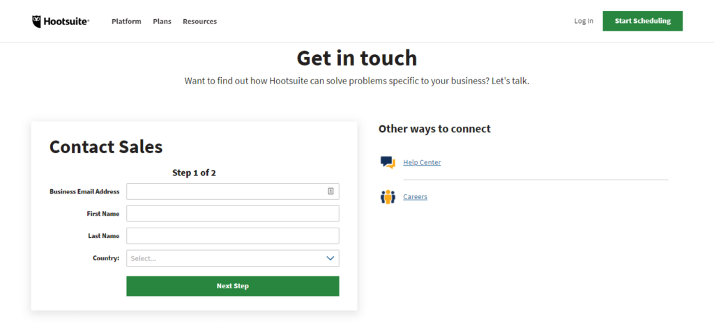
Possibly the oldest and most common type of form on the web is a contact form. Every web page should have one. Here is an example of the Hootsuite to check.
Gone are the days when businesses used to display their email addresses publicly on their Contact pages. This practice was to create user-friendly web form abandoned because of spamming and abuse, but also because using professionally-looking contact forms has many advantages.
For example, you can have a database of all contacts received and even connect this database to the CRM platform of your choice to turn contacts into leads and customers.
But how do you make the best contact experience for your users?
There are four most common fields used in contact forms — name, email address, the reason of contact and text field that explains it in more detail.
Generally speaking, forms with less fields stand a better chance of successful completions. Ask only for basic contact information that will help you respond with precision.
For “the reason of contact” field it’s advisable to offer several most common options to help users choose quickly and also to help you sift through their answers to understand what the most common questions/requests/complaints are. You can derive stats and reports based on the results from this dropdown field.
In case you have no experience or coding knowledge, here’s a nice article to help you create contact forms for any web use with a free form builder tool.
2. Registration

Registration process is always a pain for form takers.
Do it right to avoid high form abandonment. Check this Tweakyourbiz website to get knowledge about blogging.
These are the things you need to pay attention for create user-friendly web forms.
- Express clearly what the benefits of registration are. If it’s your app or website registration form, brief your future users on the value of signing up.
- Provide a data protection statement and disclaimer. It’s extremely important that you eliminate any doubts your users have about the use of their personal data.
- Minimize required fields. Any nice-to-have but not essential fields can be marked as optional so that your users can choose whether to invest time in sharing the information with you or simply skip the field.
- Add progress bar and pagination. If your registration form is long, break it into meaningful sections — pages. For example, you can ask for basic info on the first page, proceed to bill and credit card information on the second, and finally ask about preferences and special requests.
- Password choice shouldn’t be too demanding. It’s very annoying when a website demands that we use more than x number of letters and other characters. It’s OK to warn about password strength but try not to use force.
- Use a simplified and improved No CAPTCHA reCAPTCHA anti-spam protection. It’s more intuitive and easier, one human click is enough to pass the test.
- Allow signups via social networks. Authentication via Facebook, Google, Twitter, or other social accounts speeds up the process for your users but it also gives you access to their connected data.
As we said earlier, make the convenience of your registrants your prime consideration when creating a registration form.
We know darn well that it’s pleasurable to work with a plethora of customer information (marketing teams are especially hungry for these), but it isn’t worth the loss incurred by drop offs of users who never finished, or even started, registering for your product or service because the form was too inquisitive.
3. Orders & Payments

This is the cherry on top of a cake. Cake being your sales funnel, nicely layered.
There’s a whole marketing and user experience science developed around the idea of perfecting sales funnels. Every sales funnel ends with an order or payment form.
If it was a video game — payment would be the last and the hardest stage that brings a final win (or loss). Check this PhotoADKing website for order and payment form.
Some of the principles for registration to create user-friendly web form apply to the order and payment forms as well, like for example data protection guarantee, minimizing required fields, and simplified captcha. But, there’s a lot more to think about.
To score that final goal on your website and make a user-friendly experience that translates to sales here are a few things to bare in mind when creating checkout forms:
Allow Guest Checkout
Nothing more irritating than being forced to sign up before making a purchase. I only want to buy this one thing, not yet ready to become your member or user. So, let me pay quickly and convince me later.
Display Security Seals
Your forms are using payment gateways like PayPal, Authorize, Braintree, etc., to stipulate safe payments. Your e-commerce form should explicitly display the safety seal of the payment gateway you’re using. This will make your customers feel at ease sharing their credit card data.
State Clearly The Value Of Purchase
Once a customer reaches your checkout form they have already added all the items they wish to buy. And your form should sum up the costs clearly together with taxes and fees.


