How many times have you gone shopping to return with something that was outrageously out of your budget simply because you liked its color? Don’t worry. You’re not alone. You might or might not have a traditional pendulum clock hypnotic experience, but you’re most certainly lying if you say that you’ve never felt hypnotized by colors.
Colors are evocative, powerful, sensory, and above all, an excellent means of subliminal communication. That’s why they form an integral part of every email marketer’s toolkit out there. Brands are extremely careful about the color schemes they implement in their emails because it goes a long way towards shaping customer behavior and improving email metrics.
That brings us to our next question.
What Importance Does Color Psychology Hold In Emails?
Emails with attractive color schemes and visually appealing design aesthetics are more likely to drive engagement and lead conversion than the rest. There’s no denying that colors play a significant role in influencing our choices.
A popular study titled “Impact of color on marketing” by Emerald Study reported that as many as 90% of instant product-related judgments are based mainly on color associations. Yes, colors definitely impact purchasing decisions, but that’s not all they do.
Also Read


They also:
- Boost brand awareness: Using the right colors in your logo and marketing activities can lead to your brand recognition improving by a lofty 80%. Subsequently, it inspires tremendous customer confidence in the process.
- Elevate product marketing: Your product may present solutions to a thousand different problems and still go unsold if it doesn’t have a captivating visual appearance. Therefore, the product color you choose could very well be the difference between it being a best-seller or a resounding failure.
- Improve click rates: This is a no-brainer. The more attractive your email CTA is, the greater will be the click rates.
Now that we have decoded the importance of color psychology in emails let us see how our mind perceives the most common colors around us.
Black
Besides constituting about 50% (or more) of our wardrobes, the color black is an immensely popular tool when it comes to graphic designing. While the color is traditionally associated with grief, sorrow, and gloom (not to mention the color of the grim reaper’s robe), it has an entirely different definition in the world of marketing.
Here, black is associated with elegance, intelligence, and authority, making it the color of choice of several high-end and avant-garde companies such as Chanel, Apple, and Yves Saint Laurent. These brands make ample use of black in their emails to subtly communicate their grandeur and exclusivity.
At the same time, ensure that its presence is not overpowering, for it could give rise to negative emotions in the mind of your readers. A good practice, thus, is to include a splash of bright color along with the black palette of your email.
Take a look at these examples to understand how you can use black effectively in your emails.


Source: https://milled.com/Chanel/dare-to-wear-color-VDzD4eNuj9-sqPPu


Source: https://milled.com/yves-saint-laurent-beauty-aff-uk/want-20-off-thought-so-WtkI7mCJWVdeJn1q

Purple
Purple has always been associated with royalty. In ancient times it was used to fashion the robes of kings and the garments of aristocrats to denote power, influence, and prosperity. Cut to the present, and the connotations haven’t really changed. Purple palettes invariably belong to brands that market themselves as elite, luxurious, and sophisticated entities.
On the other hand, lighter shades of purple aren’t as synonymous with nobility and instead stand for spirituality, femininity, and delicacy. Brighter and bolder shades are commonly linked with innovation, creativity, and wisdom.
Here are some examples.

Source: https://reallygoodemails.com/emails/get-a-free-comfy-purple-present-on-us
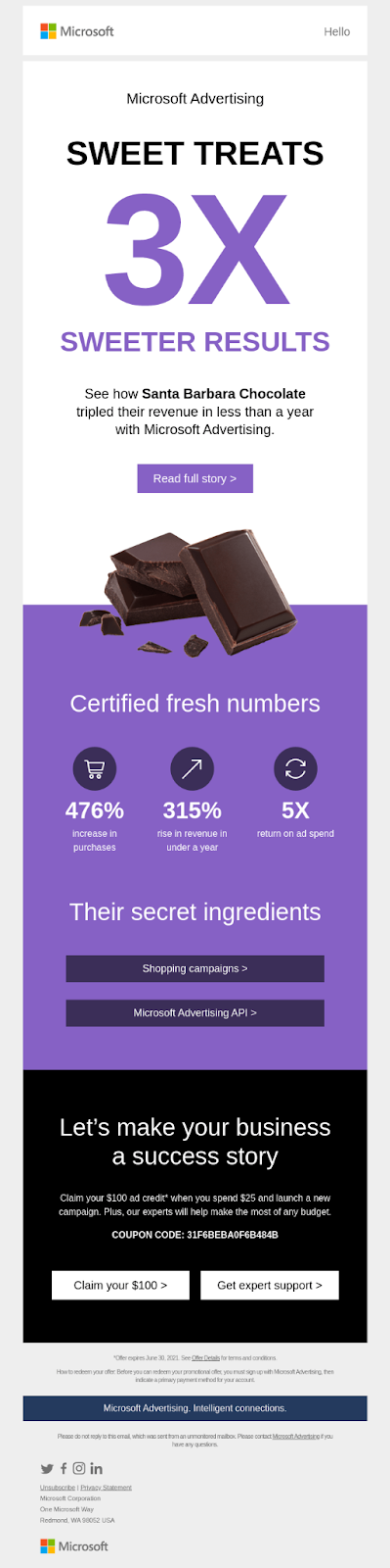
Source: https://reallygoodemails.com/emails/looking-for-5x-return-on-your-investment
Blue
The most common occurrences of blue around us are the sky and the sea, which means that our mind instantly links this color with sentiments of harmony, calmness, security, and trustworthiness. Among the primary proponents of this color are tech brands, who use it to conjure feelings of intelligence and reliability among their customers.
On the other hand, the use of blue is strictly frowned upon by the food and dining industry because it is an appetite suppressant.
Let us see a few examples.

Source: https://reallygoodemails.com/emails/a-free-font-just-for-you

Source: https://reallygoodemails.com/emails/will-you-disruptor-be-disrupted
Green
The color of Mother Nature, green, is the unmistakable flag-bearer of peace and calmness. Besides being the obvious choice of eco-friendly companies, green is also the brand color of choice for pharmaceutical and organic food companies. The color is also known for denoting growth and stability.
Take a look at these examples.
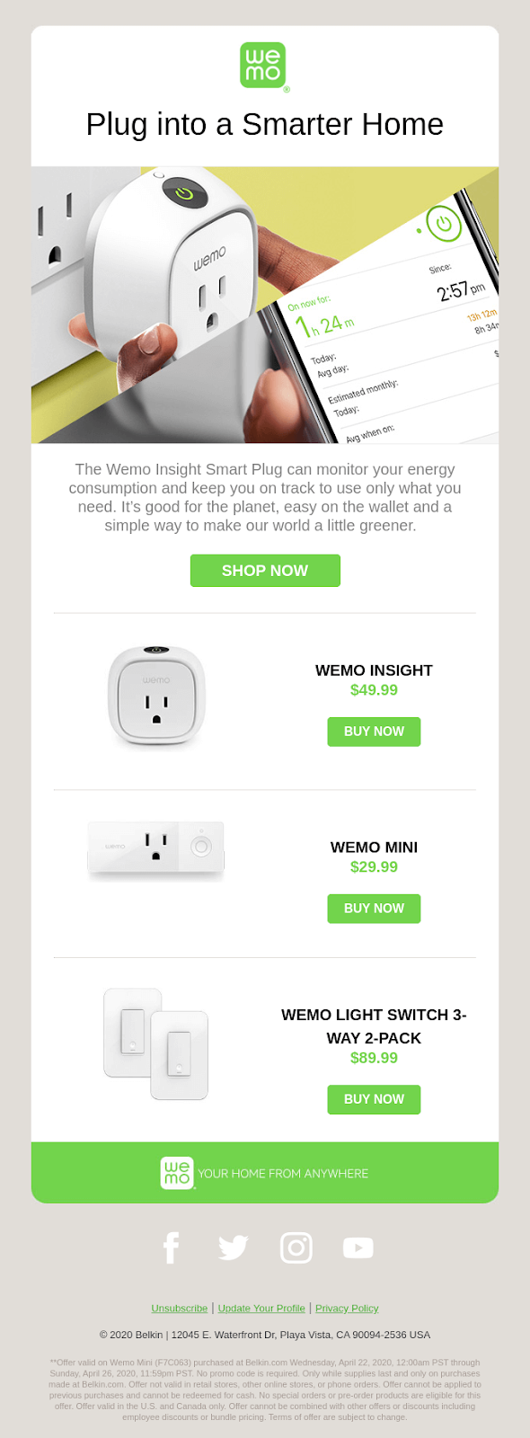
Source: https://reallygoodemails.com/emails/live-a-little-greener-with-wemo
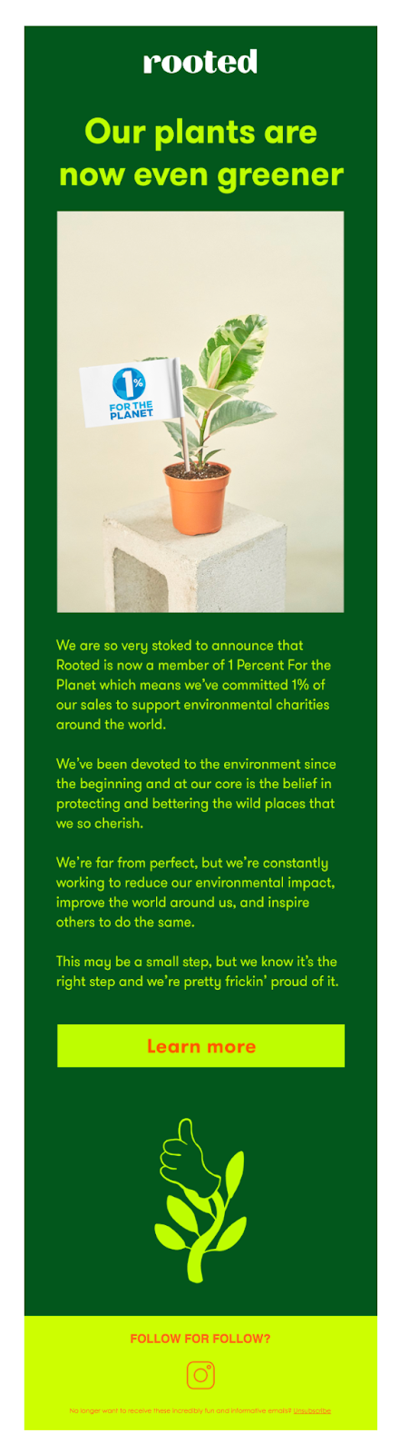
Source: https://reallygoodemails.com/emails/our-plants-just-got-a-whole-lot-greener
Yellow
Yellow and its various shades have strong undertones of creativity, optimism, and positivity. Using yellow in your emails infuses them with energy and makes them appear really warm and enthusiastic. At the same time, steer clear of overusing the shade, for it could incite anxiety in your readers’ minds.
Here are some examples.

Source: https://reallygoodemails.com/emails/make-a-plan-for-summer-learning

Source: https://reallygoodemails.com/emails/join-us-live-for-world-mental-health-day
Red
Out of all the colors out there, red is perhaps the trickiest one to decode because it has multiple interpretations. On the one hand, the color symbolizes danger and crime, while on the other, it stands for passion, love, and power. So, in a nutshell, if there’s one adjective that describes red properly, it’s this- aggressive. And this makes it an incredibly actionable color.
Here are a few examples that highlight the effective use of red in emails.
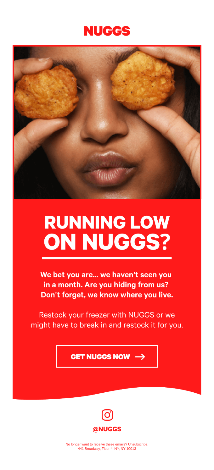
Source: https://reallygoodemails.com/emails/running-low-on-nuggs
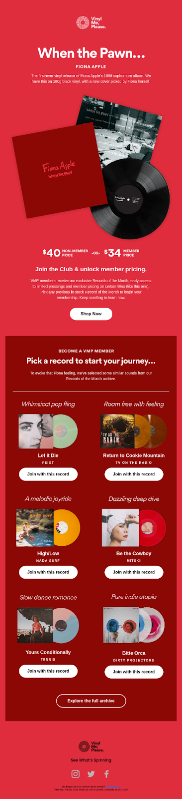
Source: https://reallygoodemails.com/emails/the-day-has-come-when-the-pawn-is-here-
White
You don’t always have to be loud to catch people’s attention. Sometimes subtlety does the trick as well. White helps you achieve just that. As the symbol of simplicity, independence, and purity, white is a minimalistic color used by brands that wish to emphasize the “substance over form” philosophy.
Take a look at these examples.

Source: https://reallygoodemails.com/emails/new-the-limited-edition-white-rollerball-pen-by-ystudio
We know we used an example earlier to highlight the masterful use of black, but they are just as evolved when it comes to using white as well. Design pioneers for a reason, after all.

Source: https://reallygoodemails.com/emails/great-gifts-apple
Using Colors In Emails- What You Should And Shouldn’t Do
Nothing in excess is good, they say, and it holds absolutely true for using colors in emails. For the uninitiated, here’s an essential Dos and Don’ts ist.
Dos
- Acquaint yourself with all the possible interpretations of the color you are using.
- Make sure your brand has a dedicated color palette and a fixed color scheme.
- Identify the color preferences of your target audience.
Don’ts
- Avoid using excessively bright colors. They invariably get sent to spam.
- Do not forget to A/B test your color combinations.
Wrapping Up
The perfect email campaign comprises pixel-perfect email templates, and those pixel-perfect templates in return are formed by clever and aesthetic use of colors. Now that you know the underlying psychology behind each color go ahead and paint your own canvas.